Jonathan Colville
Digital Designer
Gravie Member Restyle
Gravie Member Restyle
Gravie Member Restyle
Restyle of UI elements of Gravie's Member Site.
Restyle of UI elements of Gravie's Member Site.
Restyle of UI elements of Gravie's Member Site.
UI Design UX Design Visual Design
UI Design UX Design Visual Design
UI Design UX Design Visual Design
Overview
Gravie is a health benefits start-up that provides employer-sponsored health plans to employees. To support the launch of its flagship plan, Gravie Comfort, Gravie wanted to refresh its member-facing enrollment site.
The initial ask was to update the user interface and visual design for Gravie's member site while keeping UX and page structure changes to a minimum in order to release in time for most employers' open enrollment period. To meet this time constraint the team discussed opportunity-cost trade-offs and concluded certain aspects of the restyle should be kept to a minimum, which included larger UI changes, structural changes to page layouts, and the development of a shared design system to be shared between the Member Site and Gravie's Employer Portal site.
The project influenced many other aspects of the business, including all marketing and communications collateral.
I worked with a variety of stakeholders, including product owners, engineers, quality analysts, and UX designers to ensure the restyle could be shipped successfully and on time.
Deliverables
UI Audit
Concept designs
Product style guide and interface library
UI design for all pages and at all breakpoints
Visual design
UI reviews
UI Audit
To begin, I first needed to understand the current state of the member site and take note of what types of UI elements existed and would need to be updated.

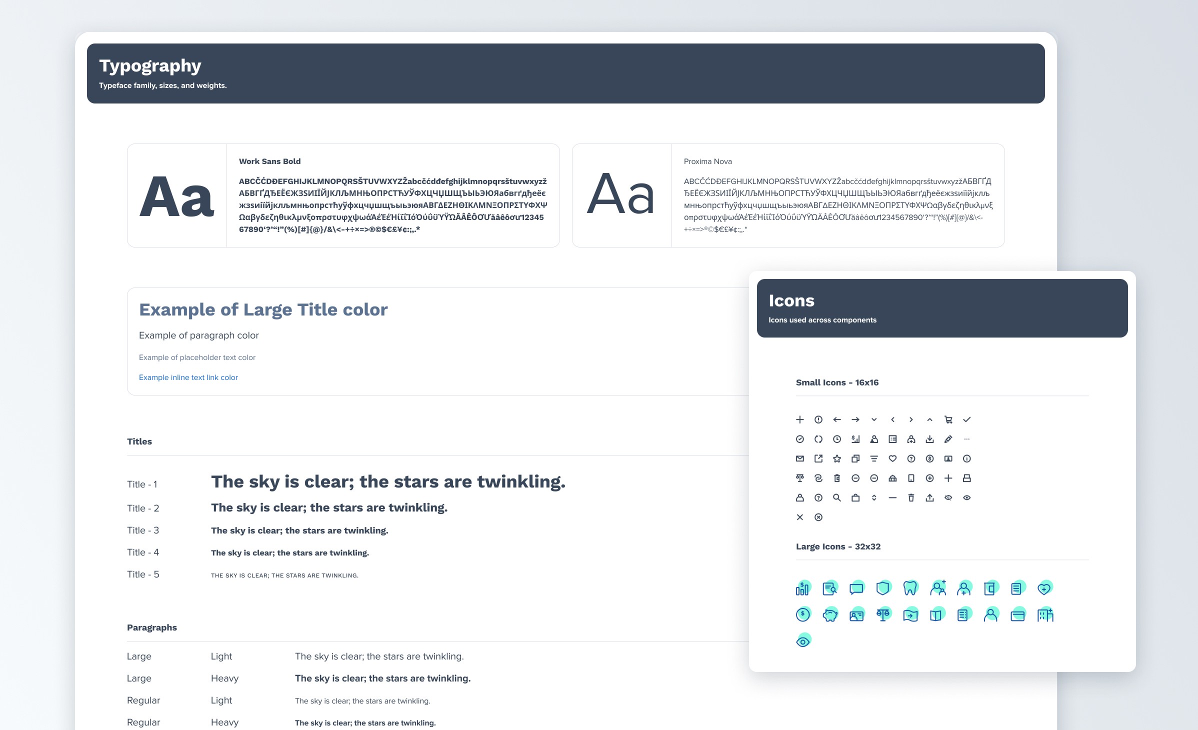
UI Design Library & Screen Designs
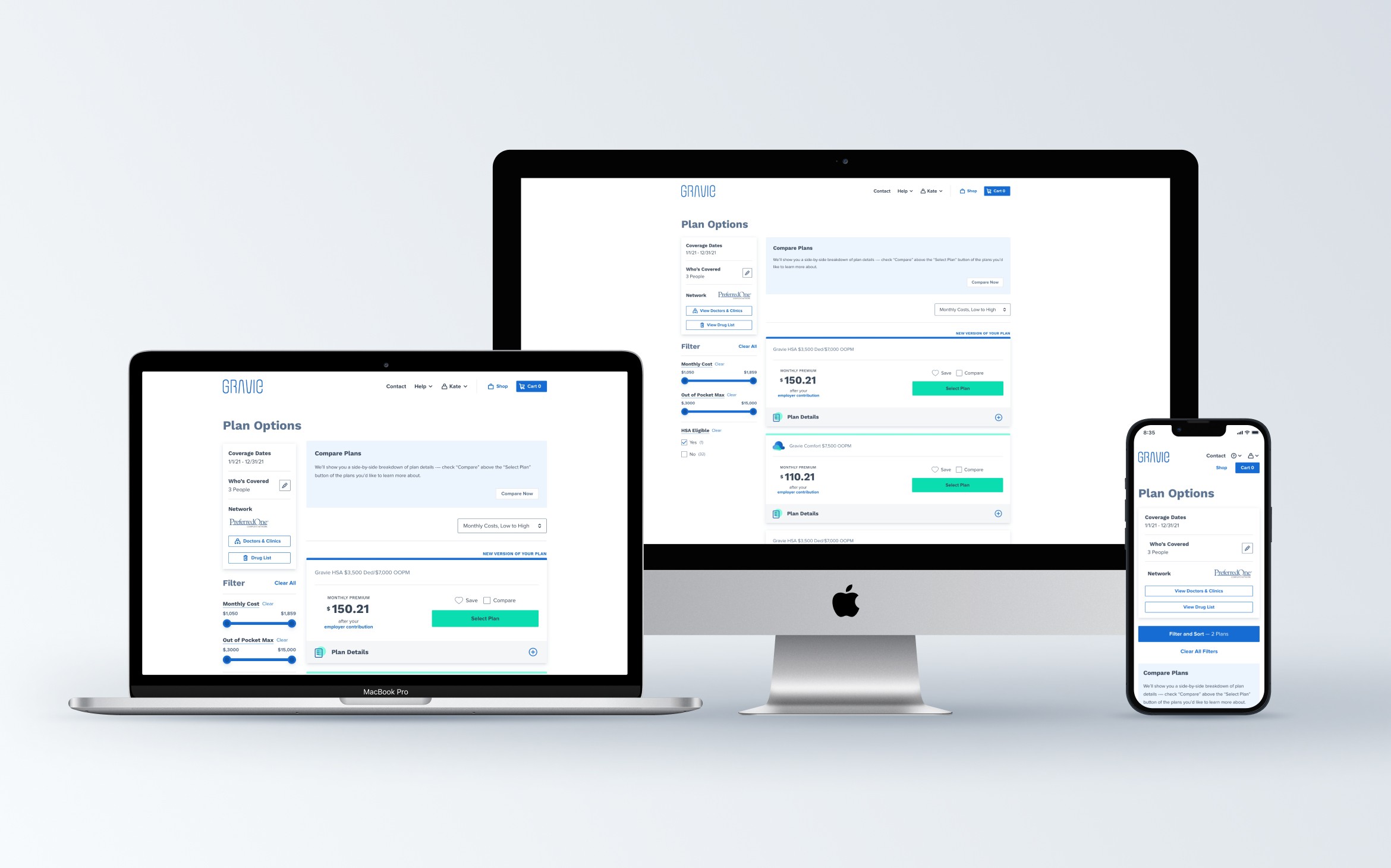
I built the initial UI library in Sketch and later transitioned to Figma when the UX team changed tools. During this transition, I wanted to ensure we were taking advantage of the benefits of Figma. When building components, I was certain to use auto-layout and component properties correctly. Doing so helped speed up the design process for future work. I also set up prototype states on library components which helped deliver more realistic prototypes for user testing.
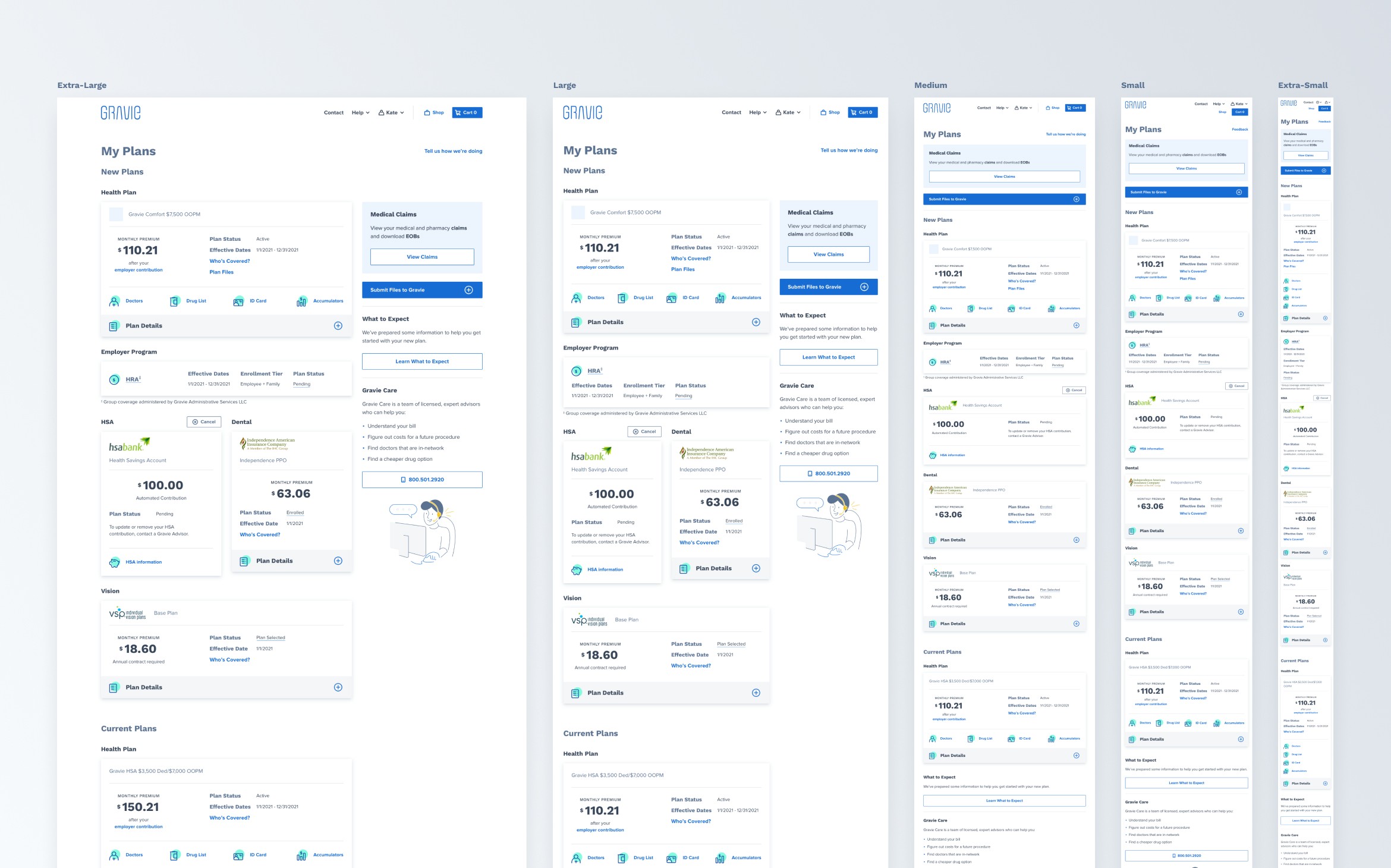
While creating individual screens for the member site, I built each screen for the different breakpoints we supported so engineers and QA would understand how the screen would adjust.


Coded Style Guides
The development team built a coded style guide for all the UI elements in order to give all the engineers a better understanding of what components were available to them. Through out the restyle efforts, I made sure to check with engineering and call out whenever I thought something should be added to the style guide.
Overview
Gravie is a health benefits start-up that provides employer-sponsored health plans to employees. To support the launch of its flagship plan, Gravie Comfort, Gravie wanted to refresh its member-facing enrollment site.
The initial ask was to update the user interface and visual design for Gravie's member site while keeping UX and page structure changes to a minimum in order to release in time for most employers' open enrollment period. To meet this time constraint the team discussed opportunity-cost trade-offs and concluded certain aspects of the restyle should be kept to a minimum, which included larger UI changes, structural changes to page layouts, and the development of a shared design system to be shared between the Member Site and Gravie's Employer Portal site.
The project influenced many other aspects of the business, including all marketing and communications collateral.
I worked with a variety of stakeholders, including product owners, engineers, quality analysts, and UX designers to ensure the restyle could be shipped successfully and on time.
Deliverables
UI Audit
Concept designs
Product style guide and interface library
UI design for all pages and at all breakpoints
Visual design
UI reviews
UI Audit
To begin, I first needed to understand the current state of the member site and take note of what types of UI elements existed and would need to be updated.
UI Design Library & Screen Designs
I built the initial UI library in Sketch and later transitioned to Figma when the UX team changed tools. During this transition, I wanted to ensure we were taking advantage of the benefits of Figma. When building components, I was certain to use auto-layout and component properties correctly. Doing so helped speed up the design process for future work. I also set up prototype states on library components which helped deliver more realistic prototypes for user testing.
While creating individual screens for the member site, I built each screen for the different breakpoints we supported so engineers and QA would understand how the screen would adjust.
Coded Style Guides
The development team built a coded style guide for all the UI elements in order to give all the engineers a better understanding of what components were available to them. Through out the restyle efforts, I made sure to check with engineering and call out whenever I thought something should be added to the style guide.